Understanding street art color theory offers a distinct advantage for marketers, urban planners, and brands seeking to leverage public art for engagement and identity. Beyond mere aesthetics, the deliberate application of color in street art dictates how a piece is perceived, its emotional resonance, and ultimately, its commercial impact. This is not about arbitrary choices but a strategic framework that influences viewer attention, brand recall, and the overall narrative conveyed in an urban landscape. For those commissioning, promoting, or analyzing street art, grasping these principles translates directly into more effective visual communication and measurable audience response. This distinction is key when discussing street art versus graffiti in urban planning contexts.
Understanding the Foundations of Color in Street Art
The visual language of street art, much like traditional art forms, relies heavily on color to establish mood, direct focus, and communicate complex ideas. However, the urban environment introduces unique variables, from natural light cycles to surrounding architectural palettes, that artists must consider when formulating their color schemes.
The Primaries and Secondaries of Urban Canvases
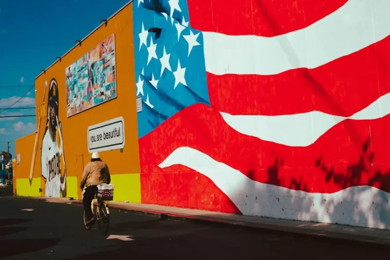
At its core, street art color theory begins with the traditional color wheel. Primary colors—red, yellow, and blue—form the foundation, often used for high impact and immediate visibility, particularly in murals designed to be seen from a distance. Secondary colors—orange, green, and purple—created by mixing primaries, offer a broader spectrum for nuanced expression. The choice to use bold primary contrasts versus more subdued secondary harmonies directly influences a piece’s visual 'shout' or 'whisper.' For instance, a vibrant red and yellow piece commands attention, ideal for advertising or landmark status, while a mural relying on greens and blues might evoke tranquility or blend more seamlessly into a natural urban setting.
Warm, Cool, and Neutral Tones
Color temperature plays a critical role in how street art interacts with its environment and its audience. Warm colors (reds, oranges, yellows) are perceived as energetic, advancing, and stimulating. Artists deploy them to create a sense of urgency, excitement, or to draw the eye forward. Cool colors (blues, greens, purples) recede visually, often conveying calm, introspection, or vastness. They can make a space feel larger or more serene. Neutral tones (grays, browns, whites, blacks) serve as anchors, providing balance and allowing more saturated colors to pop. Strategically, a brand might opt for warm, inviting tones in an area designed for high foot traffic and spontaneous interaction, or cool, sophisticated palettes for installations in more contemplative or premium urban spaces. Strategic color use can be seen in works by famous street artists to study for brand inspiration.
Commercial Implications of Street Art Color Choices
The strategic use of color in street art extends far beyond artistic expression, directly influencing commercial outcomes and brand perception within the public sphere.
Brand Recognition and Recall
Distinctive color palettes in street art can become powerful tools for brand association. When a brand commissions a mural, the consistent application of its corporate colors, or a unique palette that aligns with its identity, reinforces recognition. Consider how a specific shade of blue or a combination of vibrant hues can become synonymous with a tech company or a local business. This visual signature, embedded in the urban fabric, fosters subconscious recall and differentiates a brand in a visually saturated market. The goal is to create an immediate, memorable visual shorthand that links the art to its sponsor or message.
Guiding Viewer Attention and Engagement
Color is a primary driver of visual hierarchy. Artists use contrast, saturation, and complementary schemes to direct the viewer's gaze, highlighting key elements or focal points within a piece. A high-contrast element, perhaps a bright splash of color against a muted background, will naturally draw the eye first. For commercial installations, this means guiding viewers to a brand logo, a call to action, or a specific product representation. The psychological impact of color can also influence dwell time; engaging color combinations encourage longer observation, leading to more opportunities for social media sharing and organic promotion.
Cultural Context and Local Resonance
The meaning and impact of colors are not universal; they are deeply rooted in cultural context. Red, for instance, signifies luck and prosperity in some Asian cultures, while in others, it might represent danger or passion. Street artists, particularly those working on commissioned pieces, must research and understand the local cultural significance of their chosen palettes. Aligning color choices with local traditions, folklore, or historical events can create a profound connection with the community, fostering goodwill and enhancing the art's authenticity. Misinterpreting cultural color codes, conversely, can lead to alienation or miscommunication, undermining the commercial objectives of the art.
Strategic Application of Color Theory in Commissioned Works
For commissioned street art, the planning phase is crucial, particularly concerning color. This involves a blend of artistic vision and practical considerations to ensure the final piece achieves its intended impact and longevity.
Pre-visualization and Digital Mock-ups
Before any paint touches a wall, digital tools allow for extensive experimentation with color palettes. Artists and clients can use software to create mock-ups, visualizing how different color schemes will appear on the specific urban canvas. This process accounts for variables such as wall texture, surrounding architecture, and anticipated lighting conditions throughout the day. Pre-visualization helps in making informed decisions about saturation levels, contrast, and overall harmony, mitigating risks of color clashes or an artwork failing to stand out as intended. It's a critical step for aligning artistic intent with commercial objectives.
Materiality and Durability
The choice of paint and surface significantly impacts how colors are perceived and how long they last. Different types of spray paint, acrylics, or exterior house paints have varying opacities, finishes (matte, satin, gloss), and UV resistance. A vibrant blue might appear dull on a porous brick surface or fade rapidly if exposed to intense sunlight without proper sealant. Understanding these material properties is essential for maintaining color integrity over time.
Best for: Long-term installations and brand assets that require consistent visual quality.
Considerations for color durability:
- UV Resistance: Essential for preventing fading in direct sunlight.
- Pigment Quality: Higher quality pigments retain their vibrancy longer.
- Surface Preparation: Proper priming ensures true color representation and adhesion.
- Sealants/Varnishes: Protect against environmental wear and enhance color depth.
- Environmental Factors: Humidity, pollution, and temperature fluctuations can affect paint integrity.
Pro Tip: When commissioning street art, always request a color swatch test on a small, inconspicuous section of the actual wall surface. This accounts for unique surface porosity and how the chosen paints react to natural light in situ, preventing costly color mismatches between digital mock-ups and the final physical output.
Maximizing Visual Impact and Longevity
To ensure street art delivers sustained visual impact and commercial value, a holistic approach to color management is essential. This extends from the initial design phase through to ongoing maintenance. Selecting palettes that complement the existing urban environment, rather than clashing with it, can enhance a piece’s integration and public acceptance. For instance, using colors that subtly echo nearby natural elements or architectural features can create a sense of belonging. Conversely, a deliberate high-contrast palette might be chosen to disrupt and provoke, depending on the art's purpose. Regular inspections and touch-ups, particularly for areas exposed to harsh weather or vandalism, are crucial for preserving the artwork's original vibrancy and ensuring its continued effectiveness as a visual asset. The long-term commercial return on investment from street art is directly tied to its enduring visual quality.
Frequently Asked Questions
How do street artists choose colors for maximum public engagement?
Artists often consider the location's demographics, cultural context, and the desired emotional response. High-contrast colors and warm tones tend to attract immediate attention, while cooler, harmonious palettes can evoke a sense of calm or sophistication, influencing engagement type.
Can color theory in street art influence local business traffic?
Yes, strategically chosen and well-executed street art can act as a visual landmark or a 'photo opportunity,' drawing foot traffic to specific areas. Colors that align with a brand's identity or create an inviting atmosphere can indirectly boost local business visibility and customer interest.
What role does natural light play in street art color perception?
Natural light significantly alters how colors are perceived throughout the day. Artists account for this by selecting pigments that maintain vibrancy under varying light conditions and by considering how shadows and direct sunlight will interact with the artwork's palette.
How can color in street art contribute to urban revitalization efforts?
Vibrant and thoughtful color use in street art can transform neglected spaces, making them more inviting and visually appealing. This can foster community pride, deter vandalism, and signal investment in an area, contributing to broader urban revitalization and economic development.