
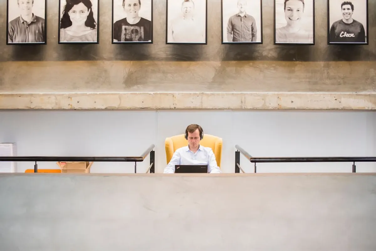
A well-executed gallery wall transcends mere decoration; it functions as a curated visual narrative, capable of shaping perception and enhancing spatial aesthetics. For businesses, agencies, and public-facing entities, a thoughtfully designed gallery wall can reinforce brand identity, communicate values, and create an engaging environment for clients and employees alike. The strategic assembly of art, photography, or memorabilia requires consideration of layout, content, and installation to achieve a cohesive and impactful display that resonates with its intended audience.
Understanding Gallery Wall Styles and Layouts
The foundation of any effective gallery wall lies in its structural approach. Different layouts convey distinct impressions and are suited to various types of collections and spatial dynamics. Selecting the appropriate style dictates the visual flow and overall message.
Grid Layouts: Precision and Order
Grid layouts arrange pieces in a uniform, geometric pattern, typically with consistent spacing between frames. This style projects a sense of order, professionalism, and modern sophistication. It is particularly effective for showcasing a series of related works, such as a collection of prints, photographs, or artworks of similar size and theme.
Best for: Corporate offices, minimalist interiors, showcasing sequential narratives, or creating a clean, structured aesthetic. The uniformity minimizes visual clutter, allowing each piece to be appreciated within a predictable framework.
Salon Style: Eclectic and Organic
The salon-style gallery wall, also known as a "cluster" or "organic" layout, features an asymmetrical arrangement of various-sized pieces, often with different frame styles and mediums. This approach fosters a dynamic, collected, and often more personal atmosphere. The challenge lies in achieving balance and cohesion without appearing chaotic.
Best for: Creative agencies, hospitality spaces, or areas aiming for a bohemian, artistic, or curated-over-time feel. It encourages close inspection and can tell a more complex story through diverse elements.
Themed Walls: Cohesion Through Concept
A themed gallery wall organizes pieces around a central concept, color palette, subject matter, or even a specific historical period. While the layout itself might vary (grid, salon, or a hybrid), the unifying element is the thematic connection between all displayed items. This approach ensures a strong narrative and prevents disparate pieces from clashing.
Best for: Retail environments, brand storytelling, showcasing company history, or public spaces where a specific message needs to be conveyed through visual means. The theme provides an immediate context for viewers.
Curating Your Collection: Art Selection Principles
Beyond the layout, the chosen content of your gallery wall is paramount. Each piece contributes to the overall narrative and aesthetic. Strategic selection involves considering individual attributes and their collective impact.
Size and Scale Considerations
The physical dimensions of your artworks relative to each other and to the wall space are critical. A common mistake is to use too many small pieces on a large wall, which can look sparse, or too many large pieces in a confined area, creating an overwhelming effect. Introduce a variety of sizes to add visual interest, ensuring that the largest piece often serves as an anchor or focal point, especially in salon-style arrangements.
Color Palettes and Harmony
Color is a powerful tool for unifying disparate pieces. Decide whether you want a monochromatic scheme, complementary colors, or a vibrant, contrasting palette. Even within an eclectic collection, a subtle thread of recurring colors can pull everything together. Alternatively, a deliberate lack of color (e.g., all black and white photography) can create a sophisticated and cohesive display.
Mixing Mediums and Textures
Incorporating a mix of mediums—such as paintings, prints, photographs, textiles, mirrors, or even small sculptural elements—adds depth and tactile interest. Varying textures, from glossy photographs to matte canvases or framed fabric, can prevent a wall from appearing flat and one-dimensional. This diversity enhances engagement by offering different visual and perceived tactile experiences.
Practical Execution: Installation and Arrangement
The final phase involves precise planning and careful installation. Even the most thoughtfully curated collection can fall short without meticulous execution.
Planning Your Layout: Templates and Mock-ups
Before any holes are drilled, create a mock-up of your desired arrangement.
- Trace each frame onto craft paper or newspaper.
- Cut out these templates.
- Label each template with the corresponding artwork.
- Tape the templates to your wall using painter's tape, experimenting with different configurations until the balance and spacing are satisfactory.
- Step back frequently to assess the overall composition from various distances.
This method allows for adjustments without damaging walls and provides a clear guide for hanging hardware placement.
Hanging Techniques and Hardware
The choice of hanging hardware depends on the weight of the artwork and the wall material. For lighter pieces, simple picture hooks or adhesive strips may suffice. Heavier items require wall anchors, stud finders, and D-rings or wire hangers. Ensure all hardware is rated for the weight of the item it will support, and use a level for precise alignment, especially in grid layouts.
Lighting for Impact
Effective lighting can dramatically enhance a gallery wall, drawing attention to individual pieces and the collection as a whole. Track lighting, picture lights mounted directly above frames, or recessed lighting can be used. Consider the direction and intensity of light to avoid glare and shadows, ensuring each artwork is clearly visible and its details are highlighted. For commercial spaces, this can be crucial for showcasing the value of the displayed items.
Pro Tip: When designing a gallery wall for a commercial or public space, always consider the future. Plan for potential expansion by leaving strategic gaps or designing a modular system. This foresight allows for the easy integration of new pieces, updates to brand messaging, or seasonal changes without requiring a complete overhaul of the existing display.
Optimizing Your Visual Narrative
Creating a compelling gallery wall is an iterative process that moves from conceptualization to detailed execution. By strategically approaching layout, content curation, and installation, you can transform a blank wall into a dynamic visual asset. The impact of a well-designed gallery wall extends beyond aesthetics; it actively shapes the perception of a space, communicates intent, and contributes to the overall experience of visitors and occupants. Prioritize clarity of message and visual harmony to ensure your gallery wall achieves its full potential as a strategic communication tool.
Frequently Asked Questions
How high should a gallery wall be hung?
The general guideline for hanging art is to center it at eye level, which is typically around 57-60 inches from the floor to the center of the artwork. For a gallery wall, treat the entire collection as one large piece and aim to center its midpoint at this height. If hanging above furniture, ensure there is adequate space (usually 6-8 inches) between the top of the furniture and the bottom of the lowest frame.
Can I mix different frame styles and colors?
Yes, mixing frame styles and colors can add character and an eclectic feel, particularly in a salon-style gallery wall. To maintain cohesion, consider using a consistent element, such as a unified color palette for the art itself, or grouping frames by material (e.g., all wood tones, or a mix of black and white frames). A common mat color across diverse frames can also provide unity.
How do I ensure even spacing between frames?
Using paper templates (as described in the "Planning Your Layout" section) is the most effective method for ensuring consistent spacing. Once the templates are taped to the wall, you can measure the gaps precisely. For grid layouts, use a ruler or tape measure to maintain exact distances. For salon styles, aim for visually balanced spacing, typically 2-4 inches between frames, adjusting as needed for visual appeal rather than strict measurement.
What if my collection is too small for a large wall?
If your current collection feels sparse on a large wall, consider incorporating other elements beyond framed art. Mirrors, small shelves with decorative objects, wall-mounted planters, or even a statement clock can help fill space and add dimension. Alternatively, focus on creating a smaller, impactful gallery cluster on a section of the wall, allowing the rest of the wall to remain bare for a more minimalist aesthetic.